Identifying gaps in global datasets through interactive mapping


Client

Boston University’s School of Public Health

Services

Information and data design

Digital / Web

UX / UI

Deliverables

Content creation

Data organization

Data visualization

Information management

Information organization

Storytelling

UX / UI

Website design

Credits

Helios Design Labs, Developer

The project

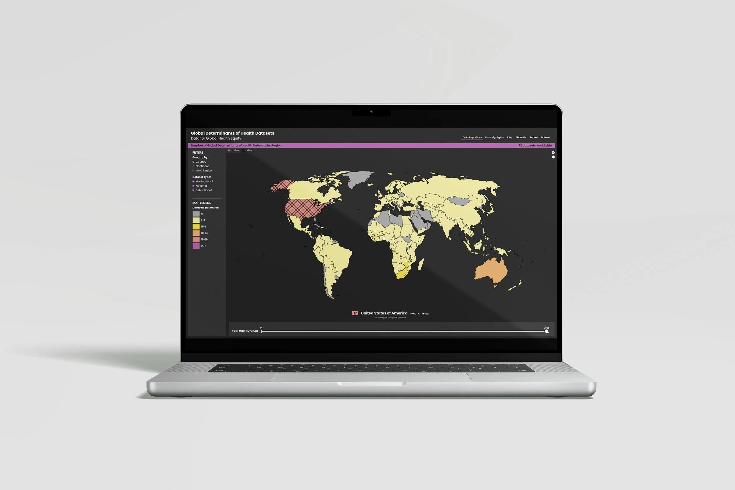
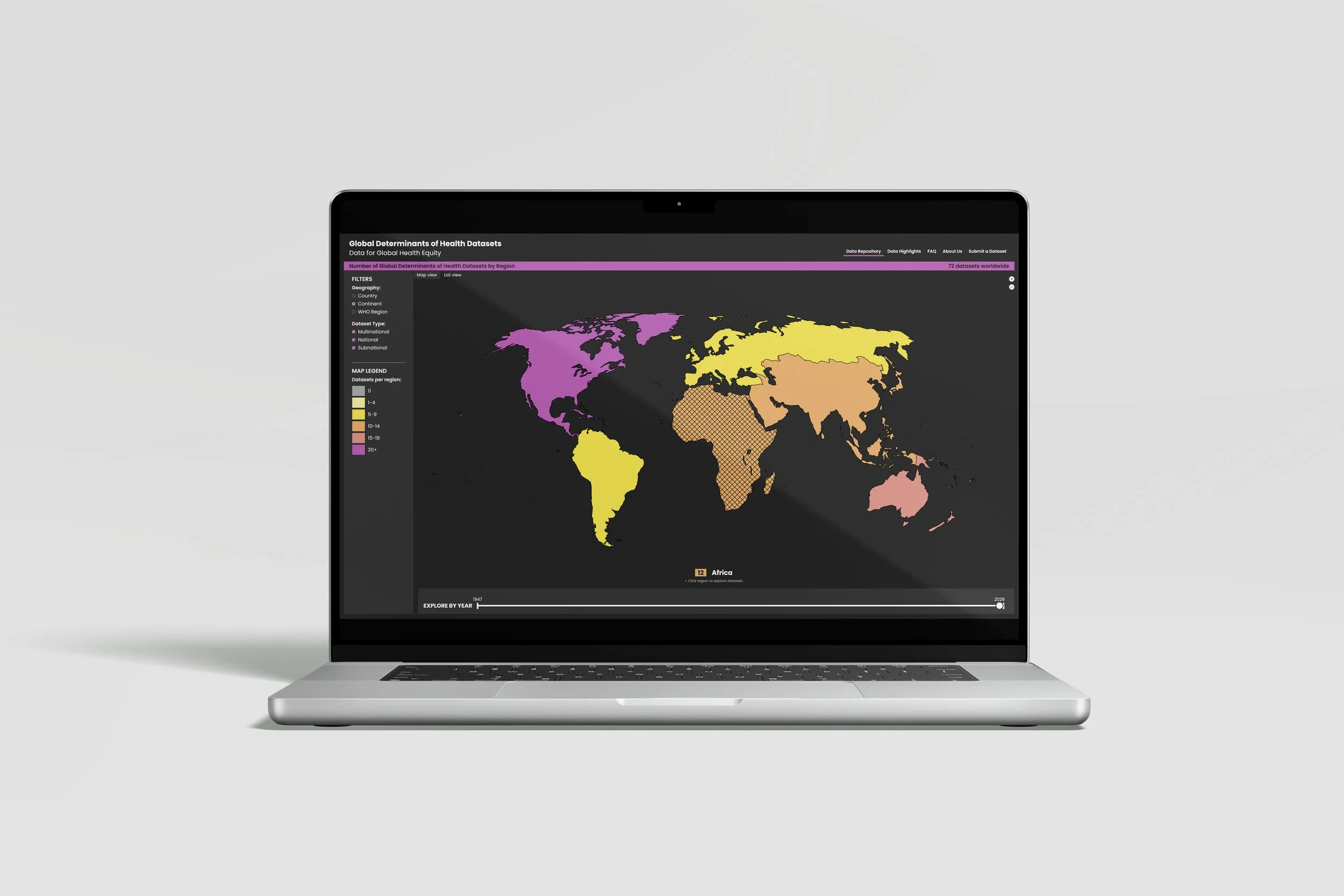
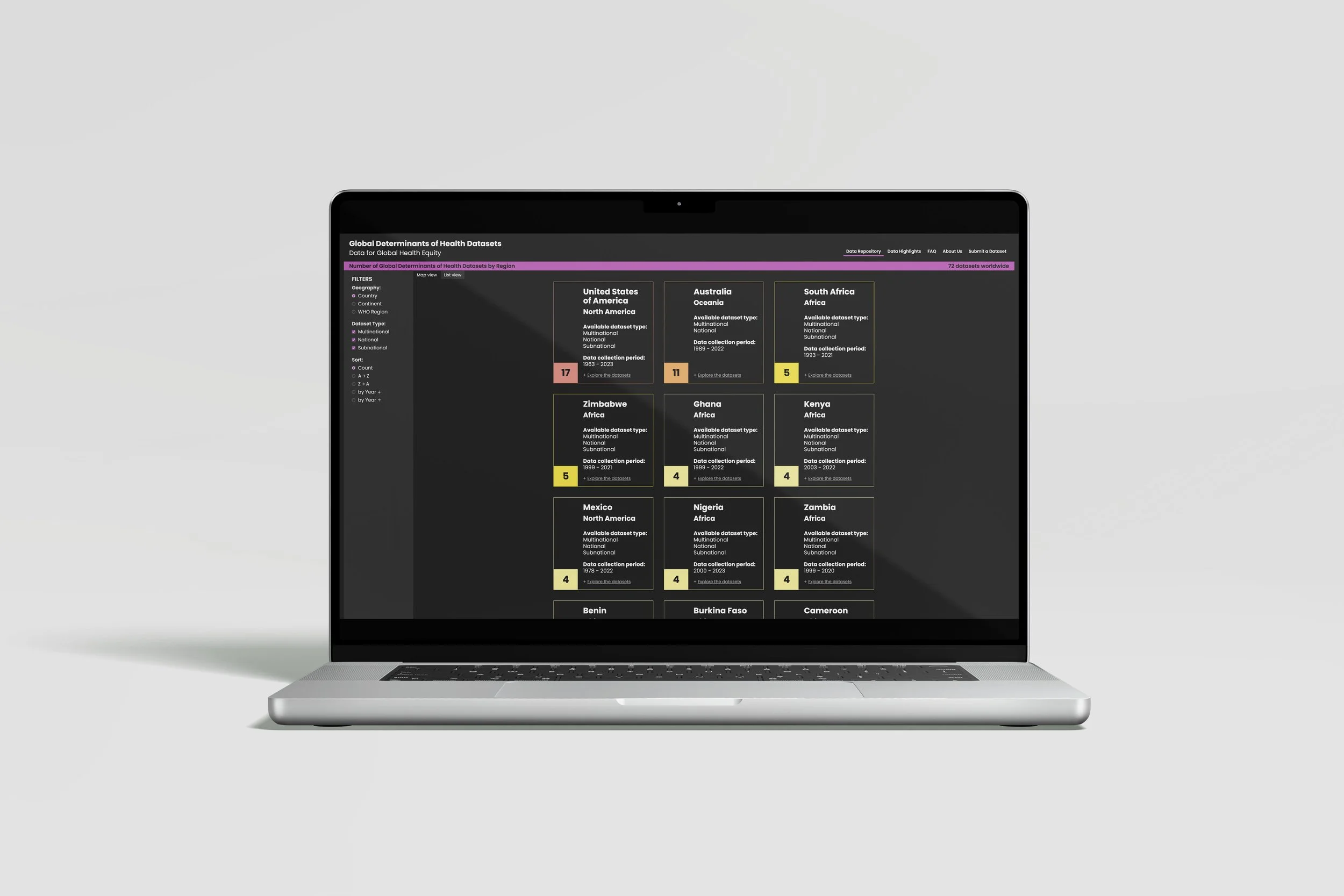
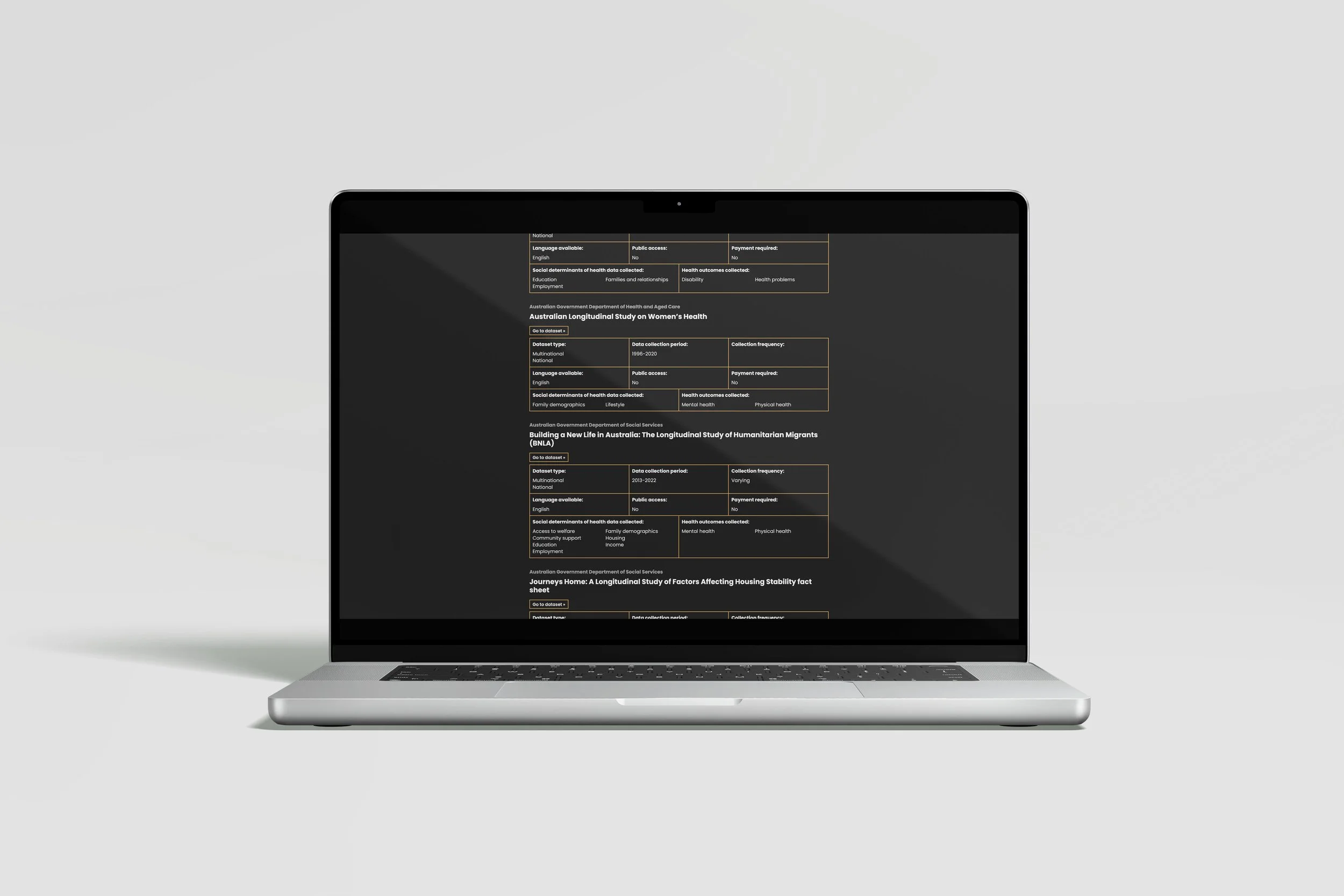
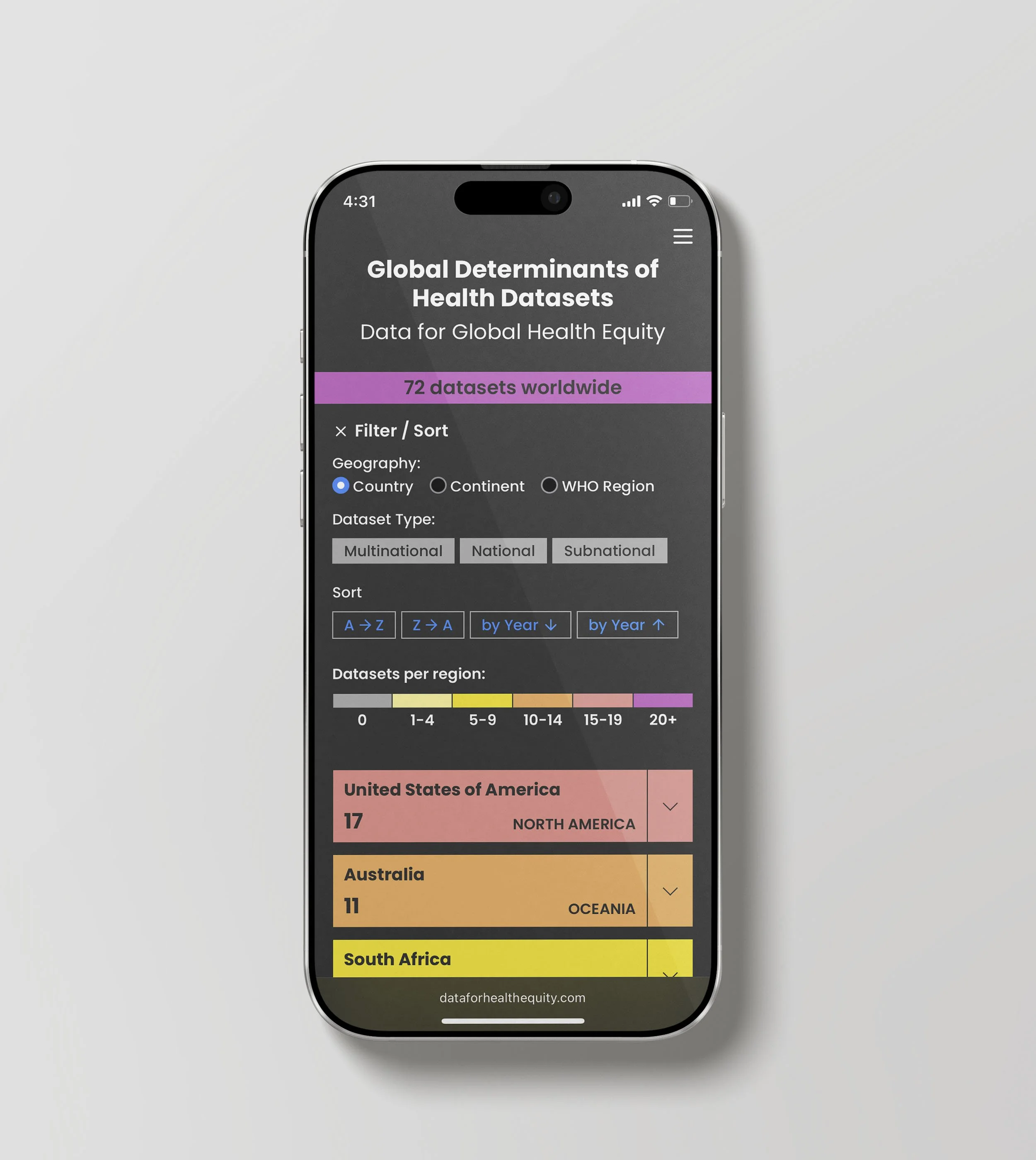
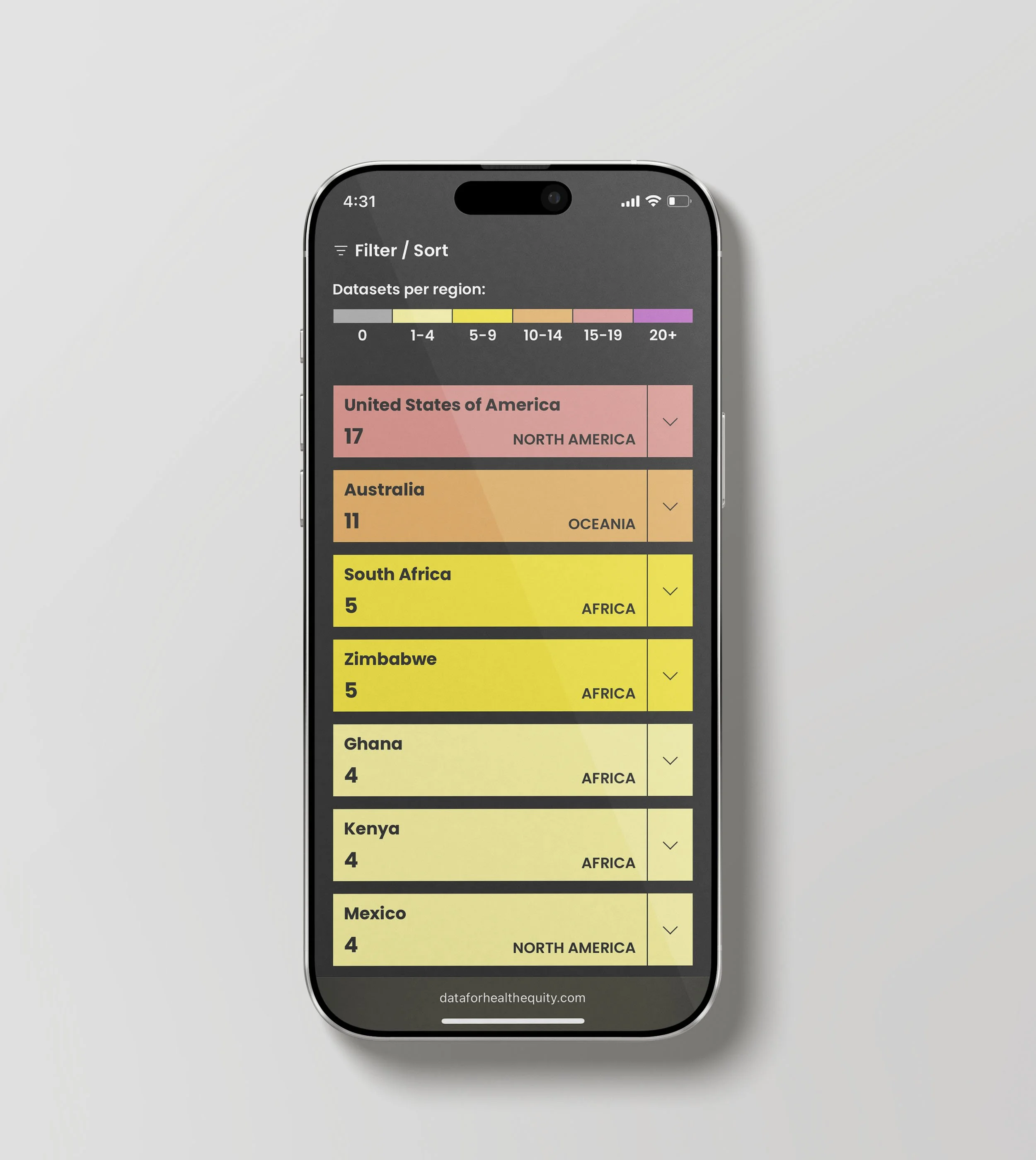
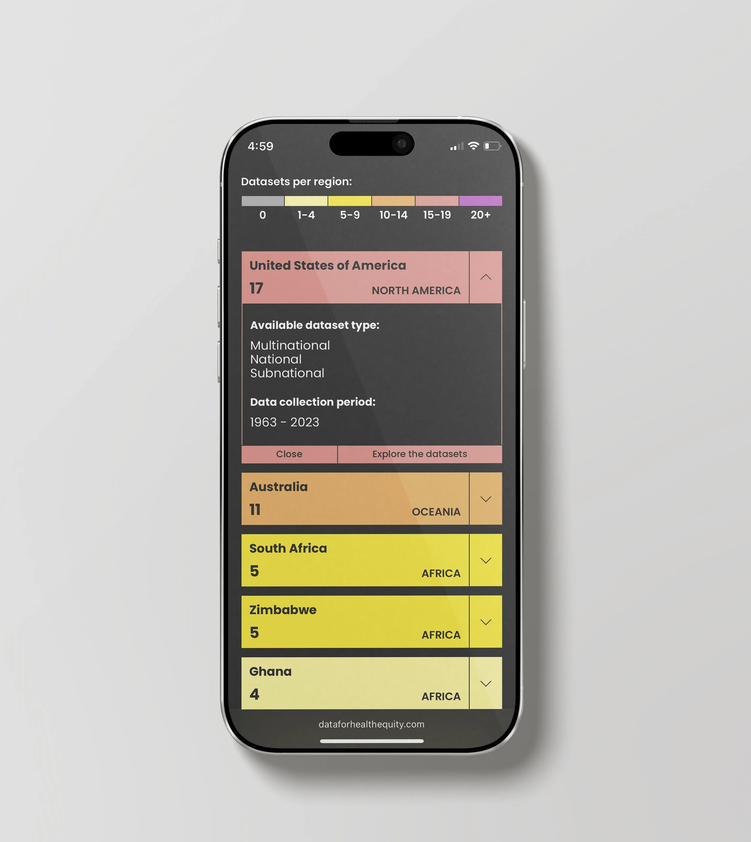
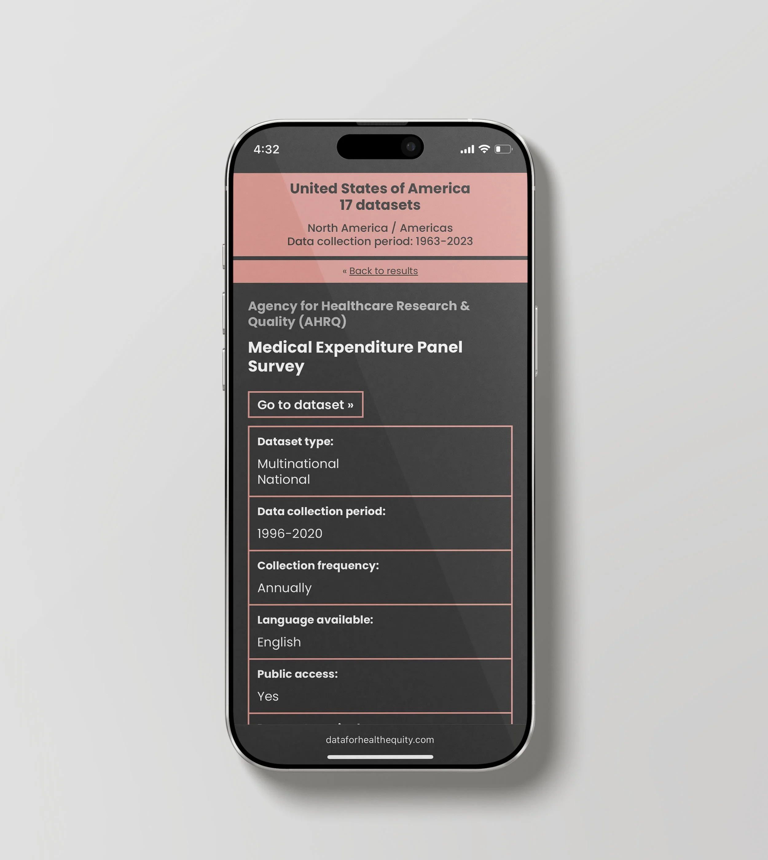
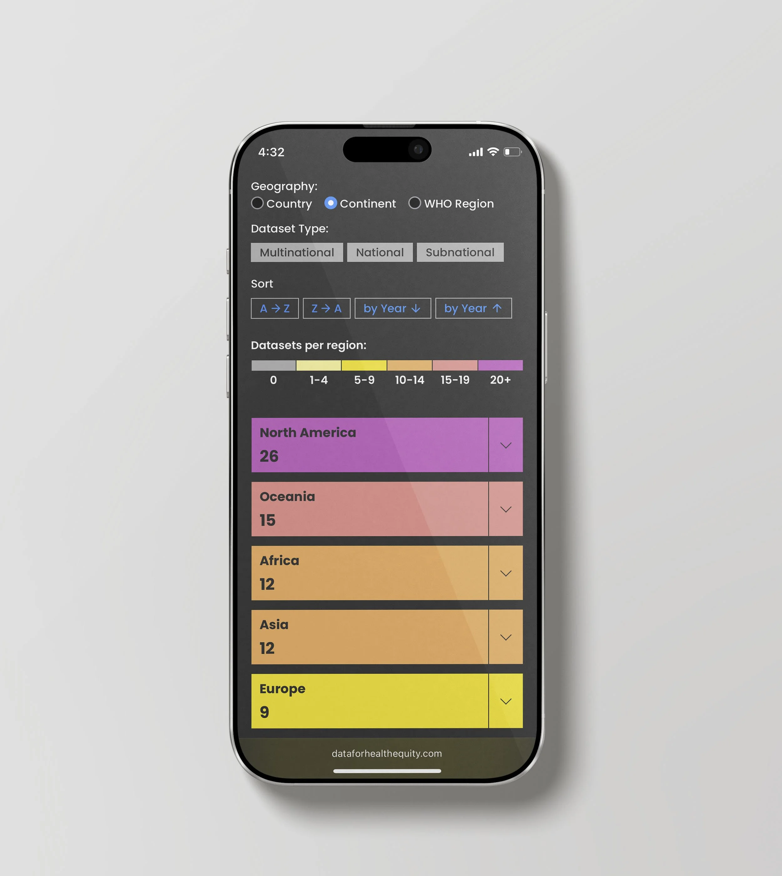
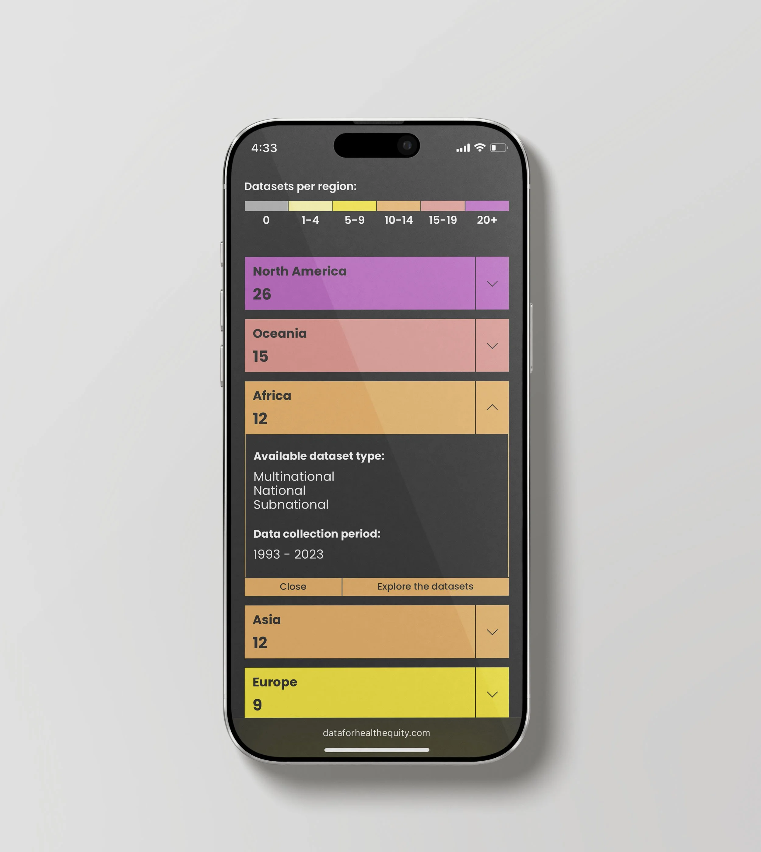
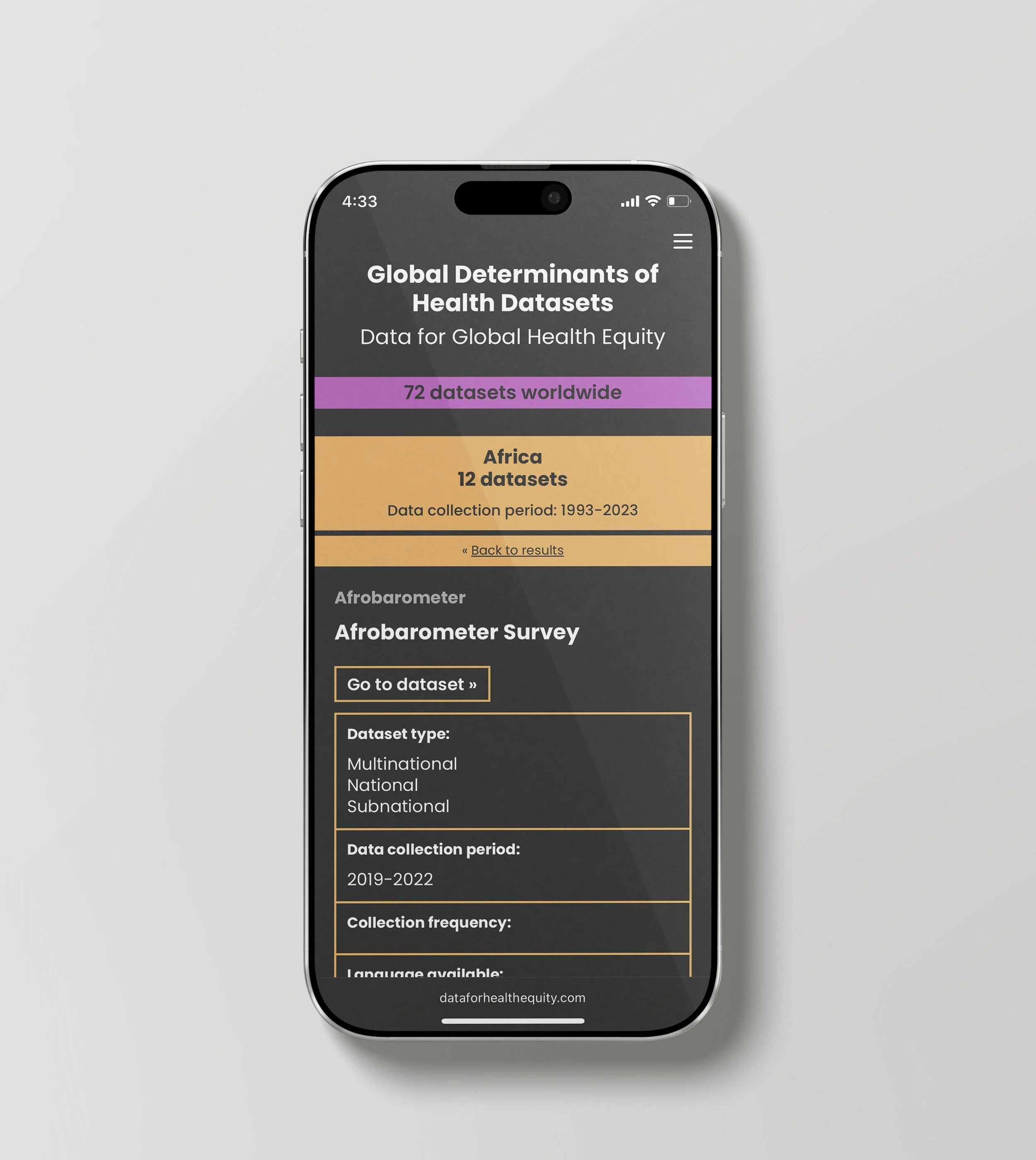
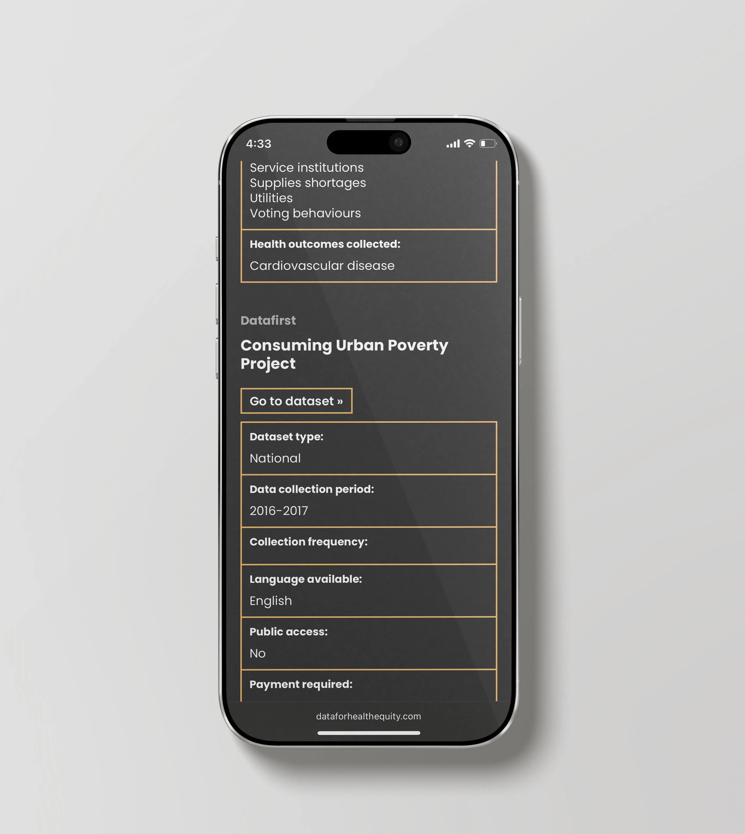
Dr. Salma Abdalla at Boston University envisioned creating an interactive repository to showcase the number of global determinants of health datasets and their geographic location. The primary goal of Dr. Abdalla’s research team was to aid research and inquiry by providing access to and exposing existing and continuing gaps across global determinants of health datasets. The repository had to be easy to navigate, low bandwidth compliant and mobile-friendly with a way to submit new datasets.

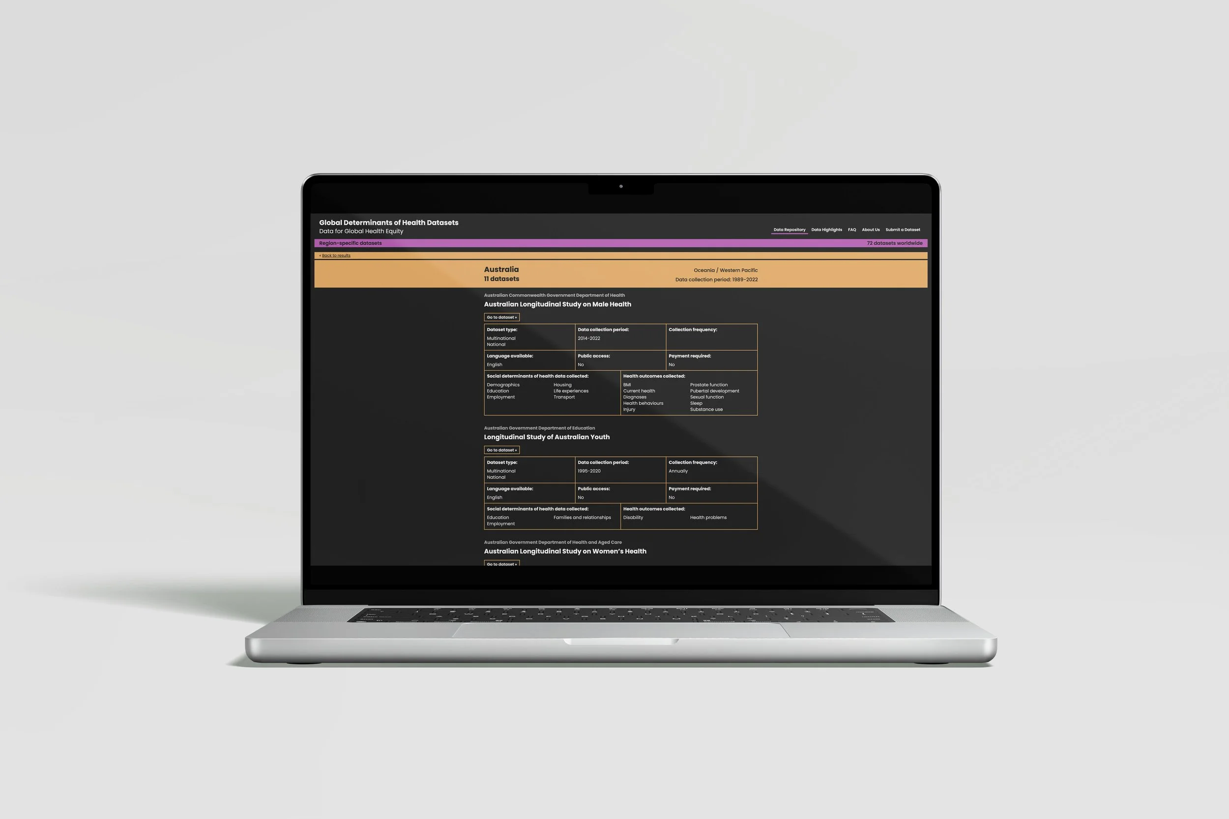
Michelle’s process involved developing a detailed spreadsheet to organize the datasets’ essential information and data collection. Her approach allows users to explore the datasets through geography, timeline, list, country, continent or WHO region. The mobile-friendly and low bandwidth version of the repository are modifications of its list view on desktop list.


Data for Health Equity

Laptop displaying a dark-themed "Global Determinants of Health" world map. Countries are color-coded in yellow, orange, and red against a black background. Minimalist sans-serif typography is used for titles and sidebar legends.
Laptop screen featuring a global map where the United States is highlighted with a red cross-hatch pattern. A timeline slider sits at the bottom, and a purple navigation bar tops the dark interface. Clean, professional layout.
Laptop view of the health data map with Australia highlighted in orange cross-hatch. The layout includes a left-hand filter menu and a legend ranging from yellow (low) to purple (high) data density. Dark, sleek interface design.
Laptop displaying the world map with Africa highlighted by a cross-hatch pattern. The map uses a warm color palette of yellow and orange against a dark gray background. Global navigation links appear in the upper right.
Laptop showing a grid of dark cards with white text representing countries like USA, Australia, and South Africa. Each card features a colored square icon and data collection details. Modern, high-contrast UI with a purple header.
Laptop screen displaying a detailed data table for "Australia." Sections like "Australian Longitudinal Study on Male Health" are organized in thin-lined golden tables on a dark background. Bold sans-serif headers provide hierarchy.
Close-up of a laptop screen showing scrolled content of the Australian health database. White and gold text on black provides details on various longitudinal studies. The design is structured, legible, and data-heavy.
Laptop displaying a horizontal bar chart regarding survey group affiliations. Vibrant purple and orange bars represent different continents. Large yellow text on a dark sidebar provides a key insight about African survey data.
Laptop screen showing a bar chart comparing dataset counts. A shorter orange bar for Africa (12) sits next to a taller purple bar for the US (17). Bold yellow text on the left highlights the equity gap in data representation.

Mobile low-bandwidth website

Mobile screen titled "Global Determinants of Health Datasets" on a dark background. Features a purple banner, filter/sort options with radio buttons, and color-coded regional data bars in red, orange, and yellow with bold sans-serif text.
Mobile UI showing a vertical list of color-coded country cards: USA (red), Australia (orange), and several African nations (yellow). A "Datasets per region" color scale legend is at the top. Clean, high-contrast typography on a dark theme.
Mobile view of an expanded country card for the USA. The red header transitions into a dark grey section detail area listing dataset types and a 1963-2023 collection period. Includes "Close" and "Explore" buttons in light red.
Mobile screen detailing a specific dataset: "Medical Expenditure Panel Survey." A salmon-colored header displays country stats. Below, a dark grey interface uses thin salmon-colored borders to organize dataset metadata in white sans-serif text.
Mobile interface showing the "Filter / Sort" menu expanded by "Continent." Large, colorful horizontal bars represent North America (purple), Oceania (salmon), Africa (orange), Asia (tan), and Europe (yellow) with dataset counts.
Mobile view with the Africa continent bar expanded. An orange header shows "12" datasets. Below, a dark panel lists available dataset types (Multinational, National, Subnational) and a collection period. Minimalist, modern data design.
Mobile screen for the "Afrobarometer Survey." Features a large orange continent header above a dark grey detail section. White typography and thin orange grid lines provide a clear, scannable layout for health equity data information.
Mobile detail page for the "Consuming Urban Poverty Project." Uses a dark theme with gold-bordered sections. White sans-serif text lists health outcomes like "Cardiovascular disease" and metadata like "Language available: English."

Our collaborative impact

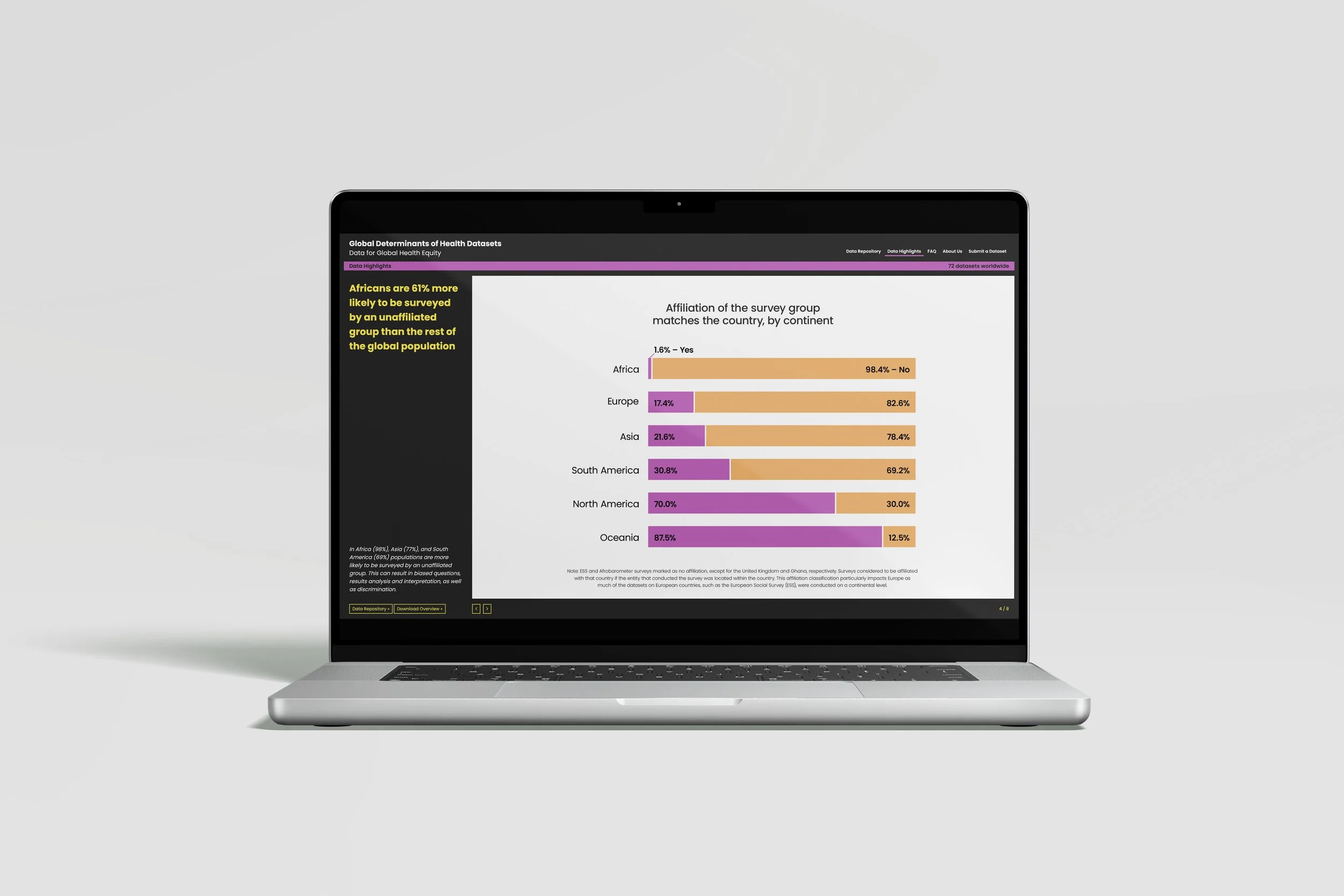
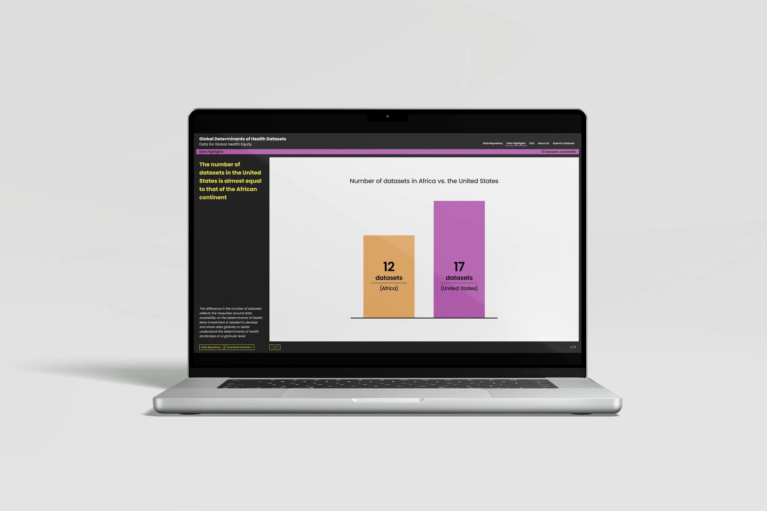
The interactive, visual, global mapping interface presented here brings to light important issues surrounding data collection and dissemination as it relates to underrepresented communities across the world.

DataforHealthEquity.com is a continuation of the essential work supported by the Rockefeller Foundation-Boston University 3-D Commission on Data, Determinants, and Decision-Making.

Previous
Previous

Enhancing reader experiences with user-focused infographics

Next
Next

Provoke and inspire change for our health with data and better decision-making